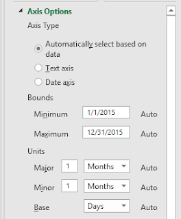
It is often necessary to show an annual pattern of data in Excel. For this example, I will show how to develop a major interval of one month for the placement of gridlines at one month intervals. Additionally, I will show a technique for adding what appears to be gridlines at the 10th and 20th of each month.
The creation of this plot is done through Microsoft Excel and Microsoft Publisher.
Below is the data that I extracted from a PDF version of an old plot using Dagra. The time interval is irregular.


The creation of this plot is done through Microsoft Excel and Microsoft Publisher.
Below is the data that I extracted from a PDF version of an old plot using Dagra. The time interval is irregular.
I then created a formula to put this data into a date format. You can see that the date may repeat based on the extracted data. Even though 1/3/2015 shows up twice, the original data underlies the data so these are two unique data points.
I create a line chart with a one month major interval. This is shown below.

I then developed the series shown below to fake gridlines at the correct interval. Each pair is its own series. So, for example, the 1/10/2015 pair is its own series. I set the y-values to the minimum and maximum extents of the y-axis.
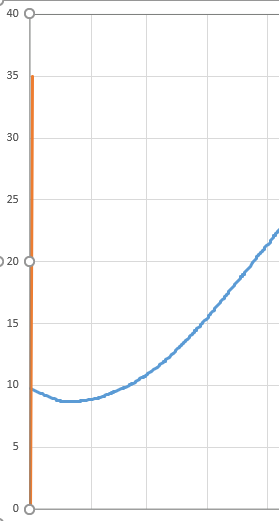
When I plot this, I get something that I don't want as shown below. My new series is pushed up against the y-axis. You may get this or something else you are not wanting. To remedy this, you need to make your new data series an x-y scatter plot. Excel does allow the main data to be a line plot and the fake gridline series to be x-y scatter plots. Remember that after you change the type of plot for your gridline series, you need to go back to select the data and specify the x-values.
After making the data series of the fake gridlines an x-y scatter, I get the following (note that I have put in the gridlines through February, and the same technique can be followed to add them in for the entire year. I add the month and day labels using Microsoft Publisher, but you may find a different program works better for you.
The final plot that I created looks like this.
Comments
Post a Comment